I know, I lost you already.
I do a lot of work for a computer hardware company and sometimes I have no idea what anyone is talking about. But I feel like I should kind of pretend like maybe I might understand a small iota of a sentence while I'm there. So while in a circle of middle-aged male engineers I smile, nod, and take lots and lots of notes. Then I rush back to my desk and read over my scribbles trying to decipher half of what I wrote down.
I was recently art directing some new collateral materials and I had to compare one company's processing speed to another company's processing speed. Of course nobody wants to compare apples to apples so I had the task of formulating a chart. A chart about flops, or rather FLOPS because it's an acronym, you know. Oh, you don't know? FLOPS or FLoating point Operations Per Second is how many times a little processor chip is computing data. I learned that yesterday. I imagine it like a fish out of water flailing about on a boat deck but it might be a bit more structured than that.
Anyway, I'm happily making my chart when I realize one company is talking about their product in gigaFLOPS and the other is in teraFLOPS. What's a girl to do? I'm certainly not going to go back over to the gaggle of guys and let on that I didn't comprehend a single word they said. So I find my own engineer.
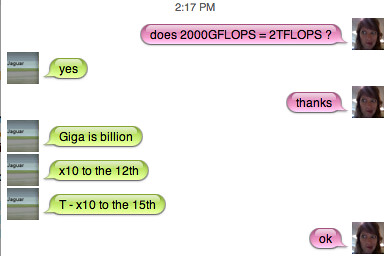
The engineer at home who knows more about computer hardware, computer software, computer programming, computer anything than anyone else, ever. He gives me a bit more information than necessary, which I love by the way. Because I do firmly believe that a designer should learn as much about their client's products as possible to give them the ability to do the best work possible. But the extra information he delivered wasn't correct and I just couldn't pass up the opportunity for a little jab.

But then I got leveled. I can feel the sarcasm dripping out of that last bubble. It should read more like "riiiiiiiiiiiight."