Sponsors

Around the web
Popular Recipes

Entries in design of the day (43)

Wednesday
Dec232009

Letters on the hillside

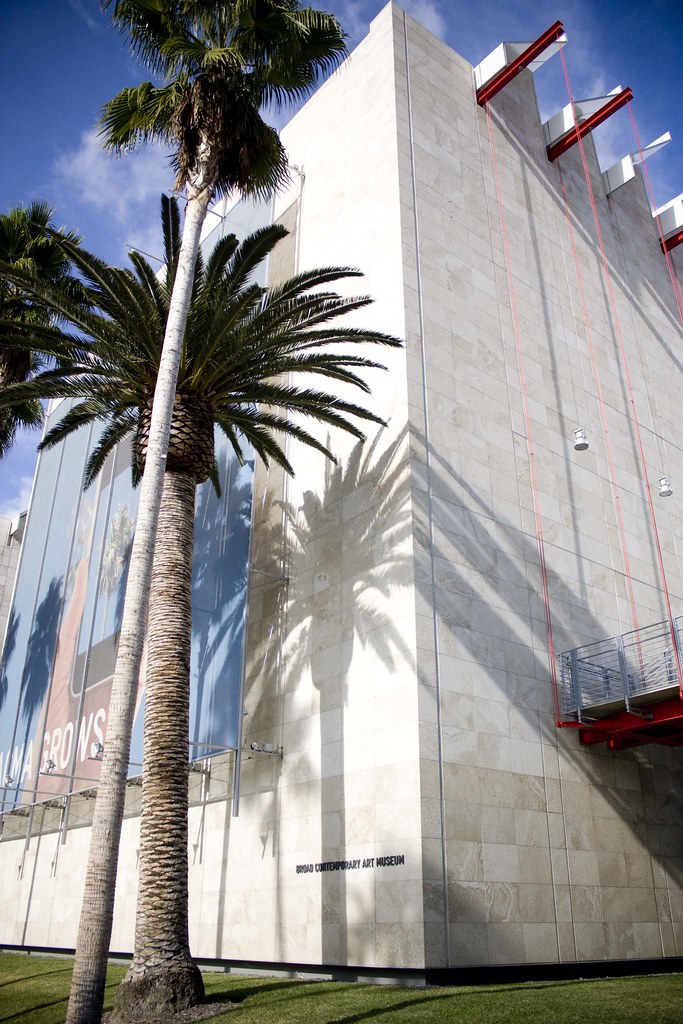
Last week I took a day off and toured the Los Angeles County Art Museum. I went by myself and I really enjoyed wandering quietly through the halls. It gave me more time to ponder what a piece meant to me and decide what I wanted to take away from the whole experience. Because art is about the experience, right?

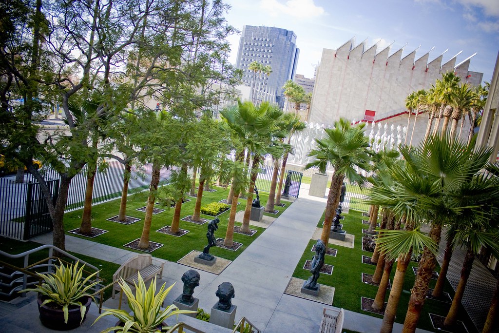
And the experience starts outside. The five museum buildings sit proudly along palm-tree-lined Wilshire Boulevard.

Broad Contemporary Art Museum at LACMA

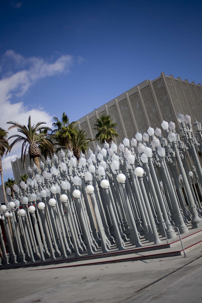
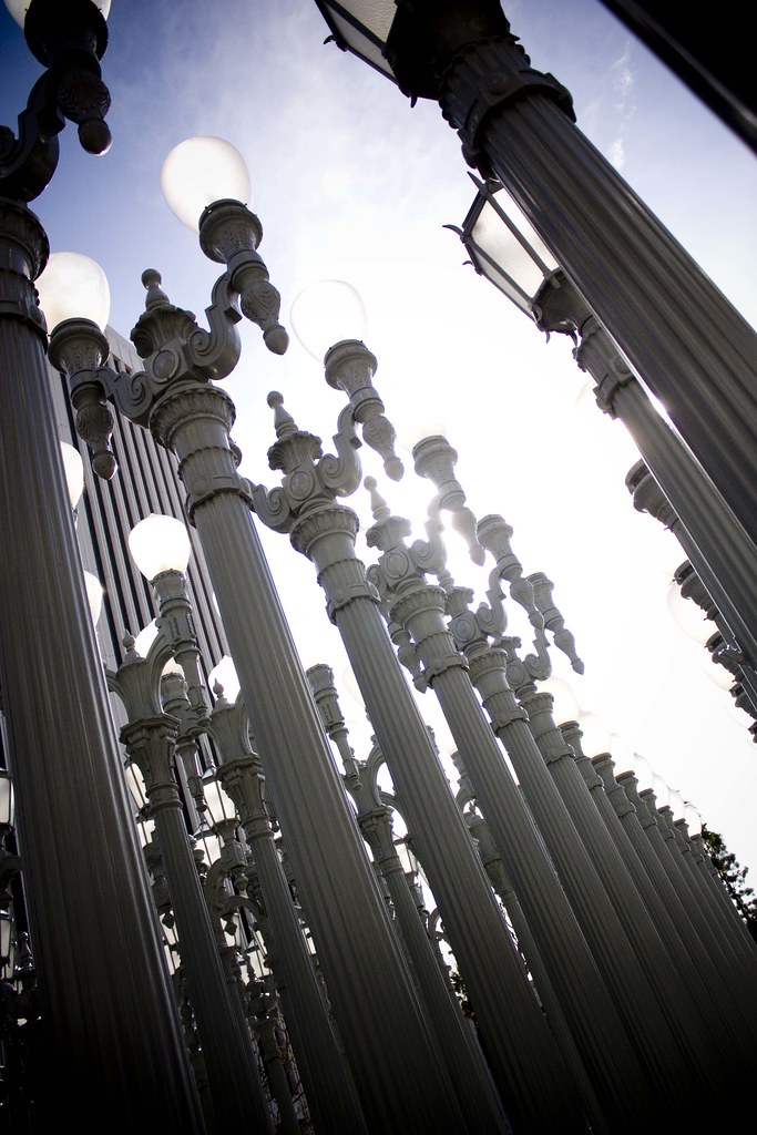
A permanent installation of streetlamps, by Chris Burden, is fun to wander through.

The Street Lamps at LACMA

The Street Lamps at LACMA

And I loved the gridded sculpture garden filled with Rodin and palm trees.

Sculpture Garden at LACMA

Oh, and the view. If you squint your eyes and look at the mountain just to the right of center, see that white bar? That's the Hollywood Sign.

View from LACMA

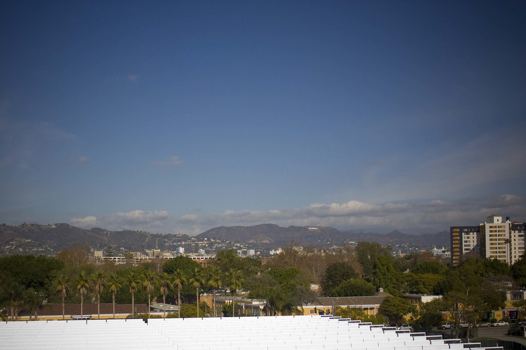
It's so fun to see in person. It's a looming landmark that you look for from all over the city, like the Eiffel Tower or the Emmaus Triangle. You can see a larger image here that shows the sign more clearly.

While inside the museum my favorite exhibit was New Topographics, a collection of photographs mostly from the 1970s that showed man-made landscapes. The images showed homes and power lines and everyday built objects. The artists did not shy away from the effect man as a whole is having on the environment. Instead of taking Ansel Adams like portraits of serenity, these photographers showed where we live and images of our everyday life. If you are in LA in the next week or so the LACMA is worth a stop.

Tuesday
Aug182009

Remember?

Junior League: Day at the Races printed invitations

I'm a graphic designer! I'm always posting photos of my cooking or my adorable dogs, but never really showing you what gets done in my studio and helps buy all that food I cook. So here are some invitations I finished up last week for a new client, the San Diego Junior League. The invites are for a fabulous day at the Del Mar Races. I just spent some time updating my portfolio, so go take a look!

Monday
Feb232009

Orange you sad?

Have you noticed the new Tropicana orange juice packaging? I like it.

Picture 23

It's bright and fresh with more white space and less clutter. But apparently I am in the minority of the opinionated. Since launching their new packaging Tropicana has been bombarded with a massive amount of negative feedback. The company is returning to its previous packaging. The New York Times writes,

The about-face comes after consumers complained about the makeover in letters, e-mail messages and telephone calls and clamored for a return of the original look.

Some of those commenting described the new packaging as “ugly” or “stupid,” and resembling “a generic bargain brand” or a “store brand.”

“Do any of these package-design people actually shop for orange juice?” the writer of one e-mail message asked rhetorically. “Because I do, and the new cartons stink.”

Others described the redesign as making it more difficult to distinguish among the varieties of Tropicana or differentiate Tropicana from other orange juices.

I think the new package looks very European, modern and clean. Everything in the grocery store with their BIG bold letters is trying to jump off the shelf to the passing consumer and it just doesn't work. The subtlety of this package spoke to me, and my husband and I even discussed how refreshing it looked.

I was happy to see the orange-with-a-straw-poking-from-it design disappear. I remember disliking it even as a child. The television ad would have a straw wielding kid hopelessly chasing around an orange on the loose. I'm sad to see it return. I thought it was gone for good.

Maybe I should have emailed Tropicana to let them know how much I liked the new look. It seems like the company was sent so much negative feedback that the started to doubt their own decision making abilities.

What do you think?

23adcol.2.500

Thursday
Feb192009

F.O. - Finished Object

As an avid knitter the only thing more exciting than receiving a box of yarn in the mail is receiving a box of yarn that has label I designed.

Baby Boutique yarn label

Client:
Plymouth Yarn Company

Project: To create a label for a new baby yarn that showed both youth and quality.

The label needed to speak for itself much like various other products that are on store shelves. Yarn has a slight advantage because it isn't sold in big, badly lit warehouses but rather small boutique stores. Consumers can ask a store clerk their opinion, potentially see knitted samples and be inspired by patterns. The yarn needs to appeal on touch and feel and also quality and value. Touch and feel are not factors I can change but the intangible ideas can be conveyed through the design of the label. Let's hope knitters like it!

Tuesday
Jan202009

Happy Inauguration Day 2009!

President Obama needs your help decorating the Oval Office, or at least IKEA think so. Restyle, redecorate, add a dog or a few secret service agents to your Oval Office redesign at www.embracechange09.com.

Decorate your own Oval Office

My design incorporates two dogs -- note how Henry is watching under the desk and Lola is watching for trespassers, a typical afternoon -- and an art easel. I would need more stuff on the tables like magazines and stickers, but all in all I'm digging it.

Page 1 ... 2 3 4 5 6 ... 9 Next 5 Entries »