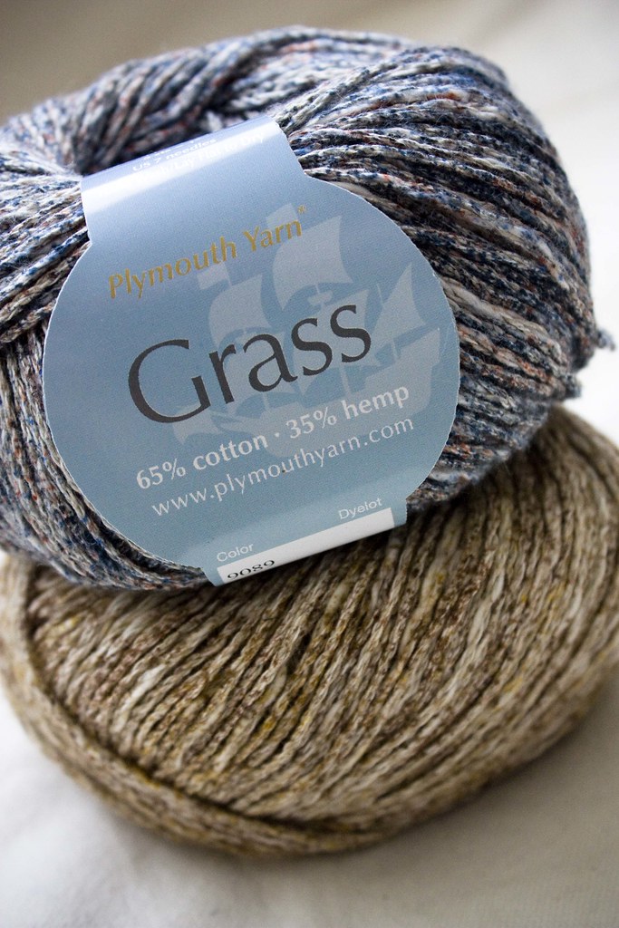
Metalico Cowl {knitting pattern}
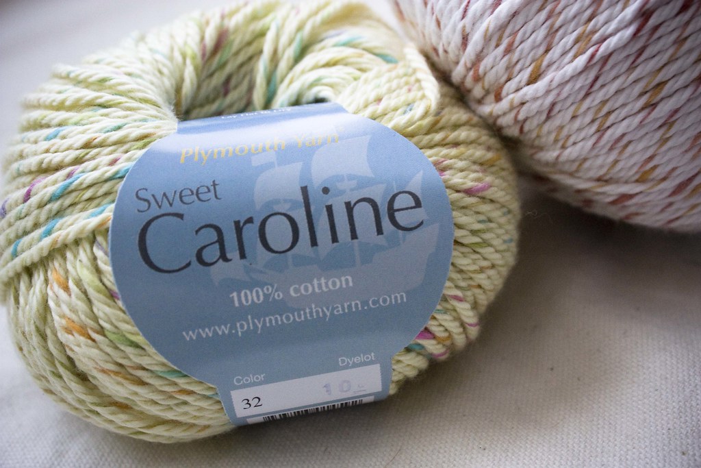
 There's A Chill in DeAire {blanket knitting pattern}
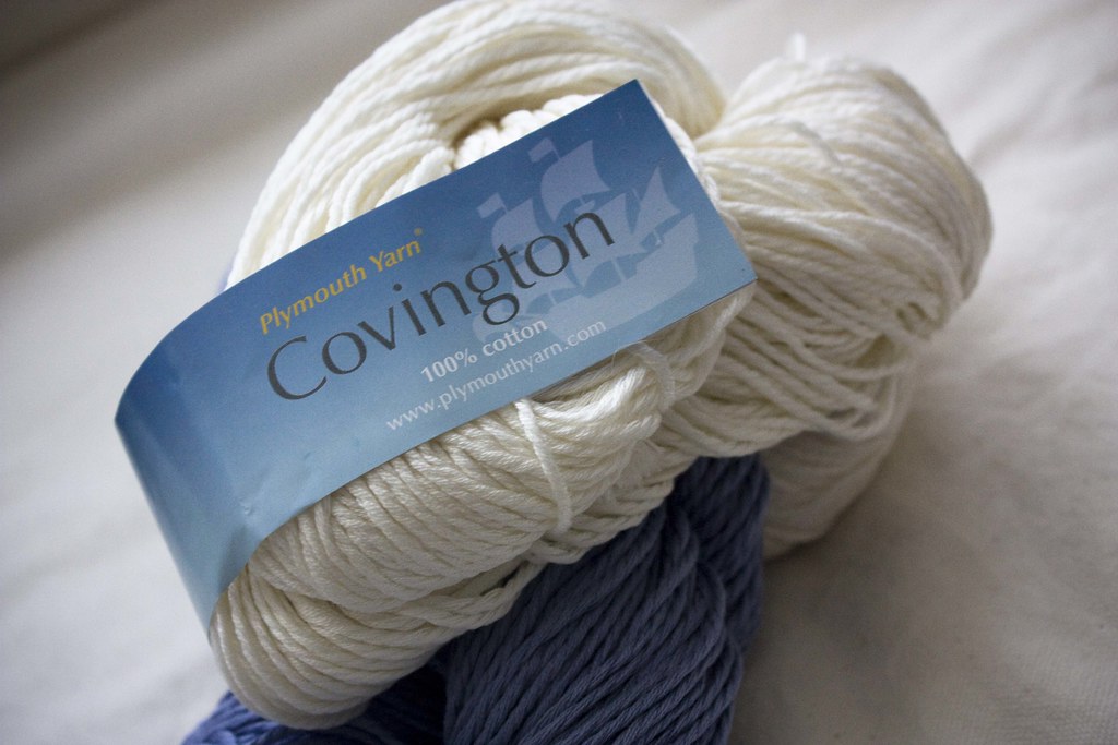
 Free: Quirky Quick Knit Scarf Knitting Pattern
 Fandago Cowl {free crochet cowl pattern}


How Not to Design a Business Card, via the US Navy
Your business card should work for you. Period. It's the version of you that will sit on someone's desk and remind them of you and the work that you do. Think of it as a mini advertisement. A business card can quickly tell someone your personality, the image of your company and the quality of work you produce.
Does your business card convey confidence and knowledge about your product? Does it show credibility in your field of expertise? Your card should tell people you understand their problems and you or your product is here to help them.
What about looks? Does your business card need to be fancy? The short answer is no. Your card does not need to be die-cut or spot varnished, but it does need to be clear and creative. A good design should make a good statement, it should also be easy to read.
So what does this card say about its owner and their product?
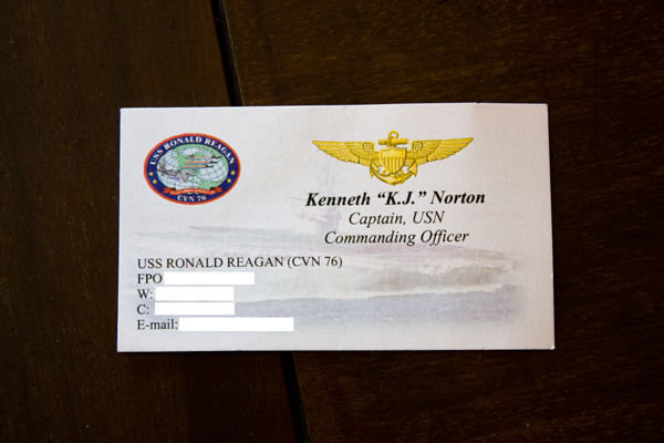
Does its design say I command the USS Ronald Reagan the world's most advanced fighting ship? Does it say I am the captain of America's Flagship? Does it even convey the ship's motto "Peace through Strength"?
No.
Not at all. It's a mess. Where's there any strength, any confidence or any personality? The design is weak and frail. And the paper? Just as awful, thin and sad. The complete antithesis of their product. They have the coolest ship on earth to work with and this is what the Navy comes up with? There's an image of the ship but its been ghosted out to near obscurity and used as a faint and confusing watermark creating an uneven margin. Even the ship's seal that has a lot of interesting symbolism is well designed but is underutilized. It sits quietly in the top left corner and is far too small to read. I've never seen a military business card before so I'm not sure if they're all this bad or if it's just the Navy that chooses to embarrass their leadership like this.
But you can avoid this kind of upset if you choose a good graphic designer that understands you and your brand. When you're working with a designer to create your business' identity, it's good to think about what you want your business card to say about your company and it's also good to consider what you don't want it to say. Show your designer the work of other brands you identify with and brands that don't match your way of thinking. All this helps you and your graphic designer work together to create something unique to your brand. Remember, your business card is a mini advertisement that talks about you when you aren't there. Take the time to frame the level of creativity, credibility and strength you want to convey.

 Heather Walpole