Sponsors

Around the web
Popular Recipes

Entries in graphic design (92)

Friday
Nov302007

Just don't tell my husband

Projects come in and finished pieces go out. I love it when I land a new client or get a new project from an established client. I never thought I would enjoy freelance design work. I don't know why I thought I wouldn't like it, maybe it was a confidence issue or maybe I thought I wouldn't be able to find enough clients locally. Whatever the reason, I'm glad it didn't completely paralyze me.

I was slow to find clients in the beginning. A friend led me to my first client and that one contract lasted nearly six months, not because it was supposed to but because I was getting my feet wet and he was incredibly busy. I had one or two other contracts during that time period. Slowly more jobs started appearing, an old friend from college needed a logo for her husband's landscaping business, my uncle needed a price sheet for his photo lab and so on.

Now jobs arrive at a steady pace, so steady that I have to keep track of what's come in, what's gone out and who still needs to pay me. I am having such a good time with all of it that I want to do more. Every job is different and that makes everyday different and that keeps me motivated. So motivated that I want a MacBook so I can sit on the couch in the evening and do EVEN MORE WORK.

Wednesday
Nov072007

Now with the worst logo I've ever seen

The global branding agency Enterprise IG has relaunched its identity. Dubbing itself The Brand Union, it sets the bar high. Here is their new logo sitting atop their previous.

So who told them to go ahead with this logo? It's hideous and down right illegible!

Here their website expounds on the ideas of brand mastery. "Part science, part art," it begins. "Knowing the measure of each in the building of a brand is the key to mastery. Lean too far to the right and you get creative flair without a strategic perspective. But lean too far to the left and you get strategy without beautiful execution. So you need a healthy balance between the two sides—a dynamic tension that’s vital for building great brands."

Balance? Between two sides? They missed all their own key points. The logo does not have any creative flair or so called beautiful execution. Maybe they just went for tension.

Then for added vomit potential they hit you over the head with the idea, that yes, they ARE A GLOBAL BRAND.

: :: ::: :: :

Brand Union website. Link.

Advertising Age article. Link.

Thursday
Nov012007

My first write up!

Wow!

Tara over at graphicdesignblog.co.uk wrote a great article about the evolution of her portfolio. She gave me a nice link right in the middle of the paragraph on a print design portfolio, referring to this article I wrote. She has some great ideas about moving your portfolio forward as your design style changes and grows. Go check it out, here.

Thanks, Tara!

Wednesday
Oct172007

New stuff! Heather Ink business cards

Finally, after months of deciding whether to get a 'real' job or work freelance, I decided to design some business cards and give the world of freelancing a try.

Conceptually I wanted my business cards to reflect my company as a graphic design studio that focuses on print design. Whenever I begin a project I list all the things I can about a topic. So for print design, let's see, type, printing, color, ink, crop marks, color bars, printing press, ink, misprints, etc. Then I focus on combining some if not all of those things into the logo.

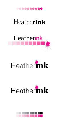
The colors weren't hard, black and pink. So then I started to play around with print bars and ink splots trying to see what looked best together. I tried different fonts some with serifs and some without. I even got a little crazy and did a gradient on Heather.

Heather Ink logo ideas

I started to see something I liked. Black type with magenta ink splatter as the dot above the "i" was really starting to grow on me.

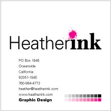
Next came business cards. Originally I thought I wanted an over-sized card, maybe 3 inches square. They passed, but I wasn't in love with them. Something was missing, they needed more excitement.

Heather Ink preliminary business card

I went back and looked at my original ideas about printing and print design. What about crop marks or registration marks? What if the printer 'messed up' my cards? How would they look?

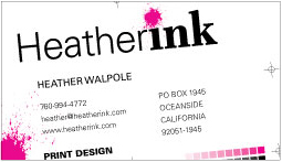
I moved it sideways, upside down, backwards. None of those ideas worked. What if the card was cut out crooked? Perfect.

Heather Ink business card

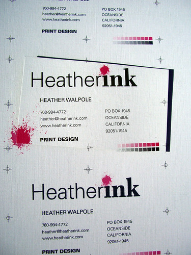
I landed some registration marks, the printer bars, an ink splot for good measure and made sure they were pretty off center.

I love them, hopefully they bring in some business!

Heather Ink business cards

Wednesday
Oct102007

A call to arms (pun intended)

The City of Philadelphia is in the midst of a homicide crisis. The murder rate increased nearly seven percent from 2005 to 2006, and the deaths in 2007 are trending to top 2006. A whopping 90% of the deaths are results of handguns. This led my favorite design professor to devise an anti-violence poster campaign to hang in bus shelters around the city.

With the campaign, designed pro bono, Frank Baseman wanted to bring in-your-face-attention to the growing murder rate and rampant handgun possession taking Philadelphia by storm.

After raising donations from local donors and businesses, the campaign was ready to hit the streets. Philadelphia thought otherwise. A mid-level government officer deemed the campaign too "intimidating," refusing to let it run in the bus shelters. Because staring down the barrel of a 2D gun is much more frightening than the fact that the city has become one of the country's most deadly cities.

Since that absurd decision, the story has been picked up by the Philadelphia Inquirer and National Public Radio. Now the poster is reaching a broad audience but not the intended audience.

Philadelphia needs to wake up, stop worrying about posters being scary and start worrying why its streets are scary. Shouldn't they be figuring out why its citizens have such easy access to handguns?

: :: ::: :: :

Read more:

AIGA: Where Is the (Brotherly) Love?

NPR: Anti-Crime Posters Shed Light on Philly's Problems

Philadelphia Inquirer: Needed: Sponsor for a message of peace
A display too lurid for Murder City?