Sponsors

Around the web
Popular Recipes

Entries in graphic design (92)

Thursday
Oct042007

WWHD

My sister Nancy most definitely has an eye for design. We both love the same sort of clean, white, stylized design but our execution has always been in different media. She has worked in the textile and retail industry for years, I have been on the 2D graphic design side. We know what we like but struggle at the other's specialty. Whenever Nancy would visit my NobleKnits yarn shop in Oceanside she would completely rearrange the store, the displays, merchandise and even furniture. I did an OK job, but she could always make the shop look top notch.

Now the tables are turned. I've been posting so many photographs over the last few months that she is getting envious! She went out and bought a camera like mine, I give her lessons over the phone and now she takes her time and considers the composition of her photos. Her new mantra? What would Heather do?

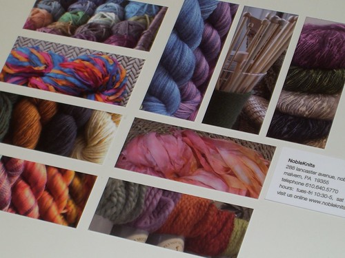
Nancy was as excited about the MiniCards from Moo.com as I was. She pulled her favorite yarns, took her photos and look at her reward:

NobleKnits MooCards

Beautiful!

I wish the whole world lived by WWHD. One day they will.

Wednesday
Oct032007

Little tiny excitment!

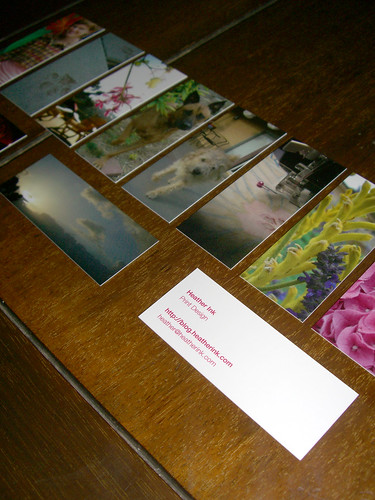
Little and fun and exciting, I just got my MiniCards in the mail from MOO.com. They're about the same length as regular business cards but only half the width. You can use provided images or your own photography on the cards. 100 cards come in a pack and each card can have a different image on the back.

I used ten of my own photos and then on the reverse I listed my company, blog site and email address. Simple, fun and so exciting!

Moo cards

Monday
Oct012007

A serious obsession not necessarily based in reason

In my profile on the right I state, "I love to be at home and I get excited about the little things in life." By little things I mean Sharpies. Right behind the living beings in my life, husband, dogs, siblings, parents, etc., comes Sharpies. Sadly, I'd be more excited if Thomas walked in the house with a 24 pack or Sharpies than if he arrived with a pair of diamond earrings.

So, I need to jot some notes down this morning and there wasn't one close at hand. By close at hand I mean don't make me lift something to get to a Sharpie. For a change of pace, I went into my office to get a fresh marker in a new color. I'd been using the same colors for a few weeks now. I stood at my desk trying to select just one color even thinking to myself, "You just need one pen to write something down, pick one!"

Choosing only one was just not an option, I went for an entire palette.

Sharpies

Mind control will not work with me! No, sir!

Wednesday
Sep262007

Pink

It takes every ounce of my being not to write the title to this post as, PINK! PINK! PINK!!!!!!. I love pink. I think it is just so exciting. I don't know where this obsession came from or what day it began. I didn't even realize I liked pink as much as I did until I received some hot pink kitchen trays from my mother-in-law one Christmas. I remember being dumbfounded as to why she chose pink trays for me as opposed to any other color of the rainbow. She simply said, "Because you love pink."

I didn't argue with her. But that day has always stuck out in my mind as the day I realized that I do, I love pink. It's insanity.

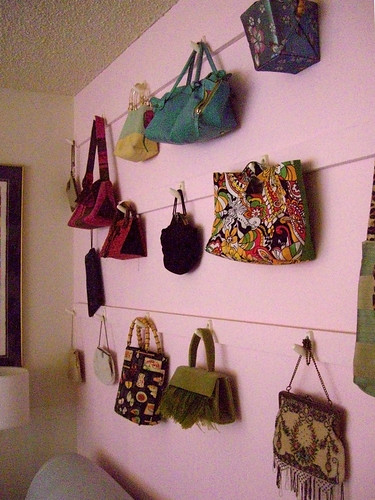
Pink purse wall

Alright, maybe it's my purse collection that's insanity, but I love the pink backdrop Thomas chose for my wall of purses. If I could, I would use pink in every room of the house. But since there's a man that lives here I stretch my color palette and discover pink other places in the world, like this sunset in La Jolla last evening,

Sunset in La Jolla

the fuschia from our wedding,

Fushia

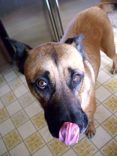
and the Lola's slurping tongue.

Pink tongue

Monday
Sep242007

Black

I love the simplicity of black. A tiny bit of black goes a long way. It just makes the perfect statement. Dark hues like navy blue or chocolate brown are trendy, but black will always be with us.

As a designer I spend a lot of time looking at black text on white pages. Well organized magazines or books are like heaven to me. My first graphic design job was as a paste-up artist at a local newspaper. What that means is that the editors would send their articles to the laser printer, I would cut them out and then I would run each headline, article, photograph and advertisement through a wax machine and stick it in the proper place on a newspaper sized sheet of blueline paper. (Click here for a more in depth explanation of this thrilling profession.) Everything had to be straight and precise. Of course, that didn't always happen. Sometimes the photo caption would get cockeyed, or the byline would be on the wrong article.

I love to read old newspapers or cookbooks and find tiny mistakes like this. There's something romantic about realizing someone's hands made this page instead of a sleek computer pagination system.
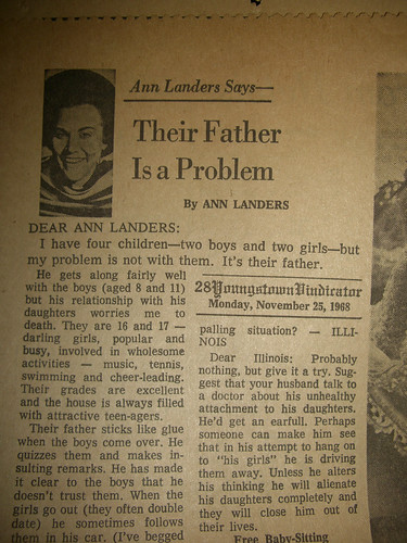
Old Ann Landers article

I know you can't stop staring at Ann Landers' awesome hairdo but please, let's get back on task. See how the right hand column is wandering off. I think these little discoveries are charming.

I also love, as you saw in my orange post, vintage cookbooks. I have a collection from my grandmother. A lot of them are produced by local women's groups my mom belonged to. I can flip through these books and find recipes, even though there's no pretty pictures, because they're organized. Not overdone with big type and lots of colors on glossy paper.

This one from 1969 was churned out on a typewriter, but it's clear and concise. And why didn't my mom ever make those beets for me?

Vintage cookbook page

Even going forward a few years, they moved on to a trendy font but kept the organization clean. Ooh, and look, let men submit recipes in 1975. Of course my dad chose an alcoholic party punch with a floating ice ring.

Vintage cookbook page

Apparently at the end of the night when the punch was all gone my dad mistakingly fed the dog the alcohol saturated ice ring. The dog staggered around howling all night long.

My dogs have never been drunk. They may act like drunk college kids running all over the place and barking unnecessarily (or was it high school that we barked at people?) But I digress!

Henry and Lola are beautiful dogs and look stunning in black and white. I think black and white photographs almost style themselves.
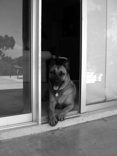
Lola

With the right composition and lots of contrast, you can present the subject as they are. Lola is beautiful and poised, Henry is playful, soulful and insane.
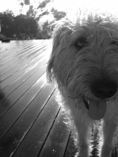
Henry on the deck